The Art of Harmonizing: Creating Your Home’s Color Scheme
Remodeling means something different to every homeowner. Whether you’re refreshing your countertops, revamping your cabinetry, or redesigning your space entirely, color is a core element of good design. The right combination can transform a space, evoking emotions and setting the tone for the entire room. Now, consider that roughly ten million shades of color can be seen with the naked eye, and it’s no wonder that choosing your scheme can feel overwhelming.
Have you ever questioned how designers create those fantastic new color combinations in your favorite home magazines? It’s all about relationships and the blend of art and science called color theory. The foundation of this theory is the color wheel. Here, we’ll take a spin around that wheel and look beyond R O Y G B I V.
“I found I could say things with color and shapes that I couldn’t say any other way – things I had no words for.”
Georgia O’Keeffe
Understanding the RGB Color Wheel
The RGB color wheel is a valuable tool that can help you understand the relationships between colors and guide you in selecting analogous hues. Complementary colors are located opposite each other on the color wheel, creating a vibrant and striking contrast when paired. On the other hand, similar colors are situated next to each other and provide a harmonious effect.
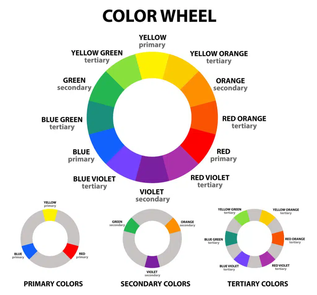
Primary Colors: Red, Green, Blue
Secondary Colors: These are the result of blending two primary colors. Orange, Green, Violet
Tertiary Colors: These come alive by combining a primary color with a secondary. Yellow Green, Yellow Orange, Red Violet, Blue Violet, Blue Green.
The Rule of Three
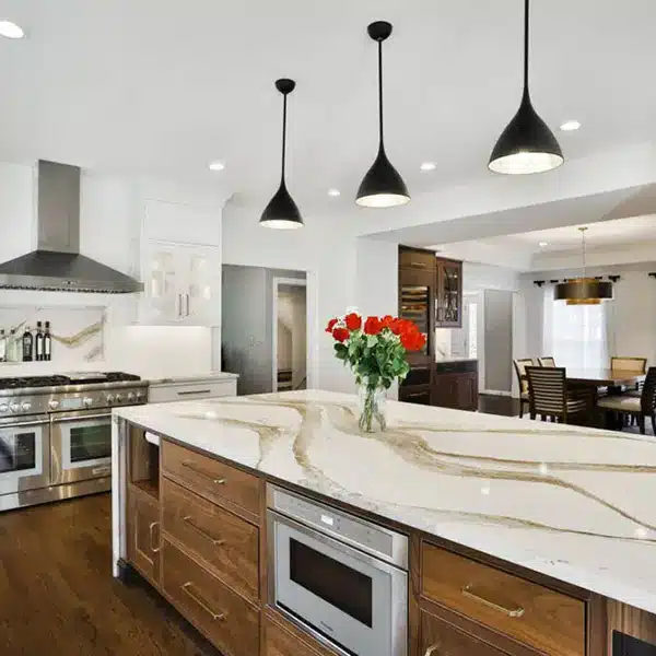
When selecting colors for your home, the rule of three can be a helpful guideline to create a well-balanced and visually appealing color scheme. This principle involves choosing three main colors: a dominant, a secondary, and an accent shade. The distribution of these colors should follow a 60/30/10 ratio, with the dominant color occupying 60% of the space (walls, cabinetry, or large furniture), the secondary color supports the primary by covering 30% (backsplash, chairs, curtains), and the accent color adding the final pop of 10% (art, accessories, features).
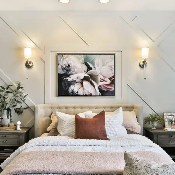
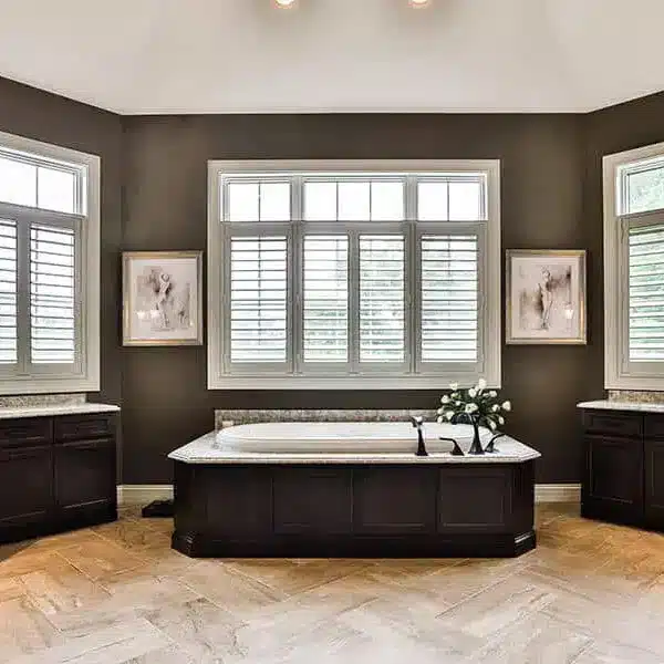
Calming Neutrals
A neutral color scheme is an excellent choice for those seeking a more serene and understated ambiance.
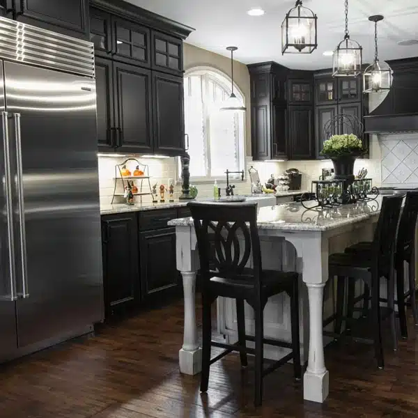
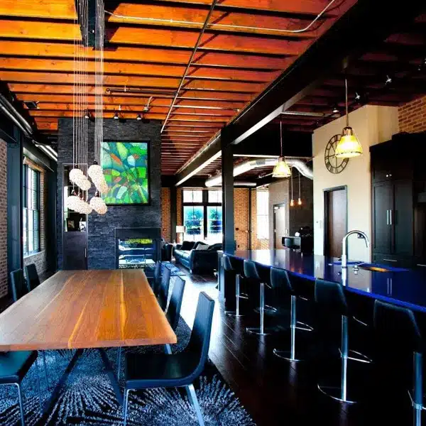
Dark Colors for Drama and Contrast
Dark tones like charcoal or cocoa can be incredibly impactful, particularly when balanced with white trim and fixtures. The key is incorporating another hue, such as a bright green, to provide a contemporary and animated feel.
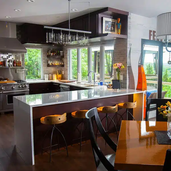
Bold and Energizing
Consider a color scheme featuring bold and bright hues to create a vibrant and energetic atmosphere. Combining complementary colors like orange and blue can produce a visually striking effect.
Ultimately, creating a stunning color scheme for your kitchen, bathroom (or any room) remodel is a personal journey. While guidelines and principles can provide a solid foundation, don’t be afraid to experiment and add your personal touch! Trust your instincts and choose colors that resonate with you and reflect your unique style.
When you need remodeling services in the St. Louis area, let Callier & Thompson be your go-to source regardless of scope or size. Having been awarded the BBB Torch Award for our commitment to exceptional standards and high ethics in our treatment of customers, employees, and suppliers, you can have confidence that you’re choosing the best. Contact us for a consultation today!
